Visual Shelf Life: Why Web Design Illustrations Go Stale
Illustration makes the web a brighter place, but there’s a risk it will grow stale. We explain how designers can avoid imitation with web design illustrations that give clients a competitive edge.

Illustration makes the web a brighter place, but there’s a risk it will grow stale. We explain how designers can avoid imitation with web design illustrations that give clients a competitive edge.

Micah helps businesses craft meaningful connections through branding, illustration, and design.
Expertise
Web illustration is a vibrant and varied form of visual communication. As a design discipline, it merges the message clarity of graphic design and the expressive capacity of fine arts. At its peak, illustration does something that photography can’t. It portrays what is familiar from a perspective that is unattainable with human eyes.
The recent influx of brands using illustration in web design is one of the best things to happen to the web in a long time. It has brought vibrancy, humor, and clarity to a range of business propositions and allowed companies to tell their stories more clearly.
Despite the positives, there are problems. At its core, illustration is a storytelling tool, but as its popularity increases, it veers toward the obligatory. We have a website, therefore we must have illustrations.
Lacking strategic vision, illustration is ornamentation, the antithesis of originality. Story is discarded, imagination abandoned. Individual websites lose distinction, and all the illustrated products and services blend together.
A smartly dressed employee sits at a tidy desk operating an abstract interface that merges with the real world as texts and emails fly by on paper airplanes that land on a cat napping next to a leafy plant framing a person doing yoga while drinking kombucha and browsing an app from which emerges a giant hand that signs a contract with an oversized fountain pen.
Surely you’ve seen it.
There are four culprits that threaten the long-term viability of website design illustrations.
Culprit 1: Imagery Lacks Cleverness
The Origin
Illustration has a rich history of instigation. For hundreds of years, it’s been used as a form of social commentary. Why? Because it poignantly clarifies the complex nature of human affairs. When people are contradictory, when experiences are confusing, illustration makes it obvious—in an instant.
The aim of illustration isn’t controversy for its own sake. Rather, the goal is to make people pause and ponder a point of view, even if it conflicts with their own. At its best, illustration is the ultimate aha moment.
The Problem
Today’s demand for visual content has robbed much of contemporary web illustration’s elucidating powers. Online, illustration rarely instigates; mostly, it instructs or embellishes.
On many websites, illustrations are 1-to-1 visual representations of the text they’re paired with. Try our unique scheduling feature! [Insert monoline illustration of calendar]
Or they portray people living “best life” scenarios thanks to products and services purchased. Try our unique scheduling feature! [Insert illustration of a coffee drinking laptop guy high-fiving a smiley face calendar]
Neither approach is potent enough to prevent website illustrations from losing their storytelling swagger.
The Remedy
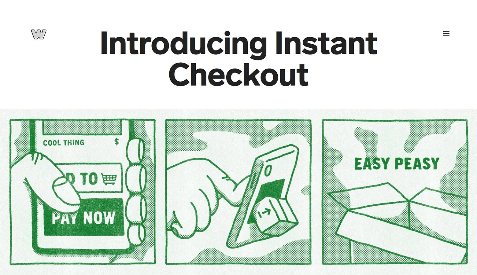
Some concepts are hard to illustrate. There are products and services that aren’t exciting or easily tied to human experiences. Here, illustrators must dig deeper during concept creation. To uncover a topic’s most compelling angles, explore its dark side.
- What are the big pain points and why do they exist?
- Who is most affected financially, professionally, or emotionally?
- Are there conflicting or controversial views among companies, customers, or experts?
Questions like these work with most goods sold online. As illustrators, we’re often tasked with showing the good, but if we don’t understand the bad, we’ll reach for tired tropes. In fact, this positive/negative balance is a key aspect of storytelling. Without the lows, the illustrative highs lose their impact.
Job Well Done: Big Cartel
Culprit 2: Rampant Imitation Ruins Novelty
The Origin
Imitation and creativity aren’t diametrically opposed. Since the world’s earliest civilizations, artists and designers have cultivated creativity through mimicry. A compelling style catches the eye. We examine it, deconstruct it, and glean its technique to enhance our own work. This is growth.
In a perfect world, imitation would be confined to learning and commentary. Styles copied would be transformed, both visually and conceptually. It rarely works this way.
The Problem
Imitation rebuffs evolution. When we encounter a popular style and attach ourselves to its orbit, we’re like old-world apprentices with a sinister twist. We misappropriate the stylistic attributes of illustrators we “follow” and promote the outcomes as our own.
Brands are complicit. Company X wants Company Y’s illustration style, so they commission a knock-off. It happens over and over, site after site, each iteration introducing new layers of entropy. Eventually, an entire industry employs a parade of degenerate clones, like Michael Keaton in Multiplicity.
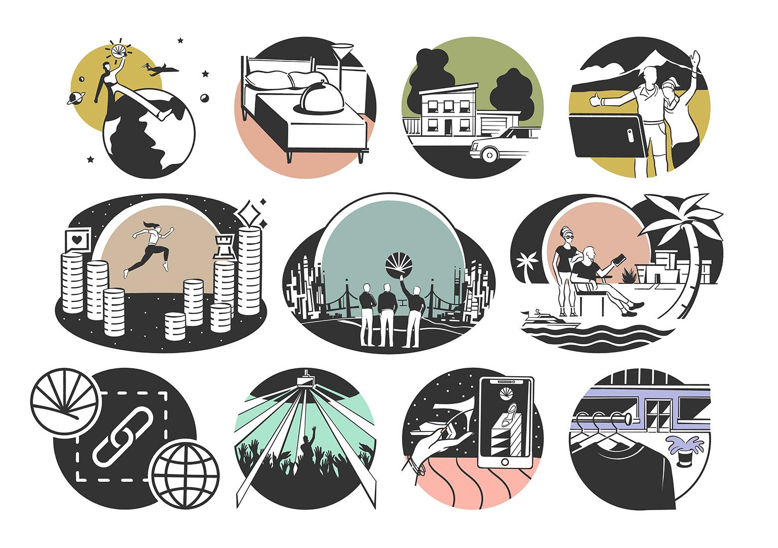
Look no further than the predominant illustration style of the SaaS landscape. It’s embarrassingly homogenous.
The Remedy
There are countless paths beyond imitation. None require creative genius or the exclusion of external inspiration. Quite the opposite; illustrators need ample exposure to reference material. The more we see and store away, the more we can reinterpret. A number of exploratory exercises are possible:
- History mashup. Reimagine an inspirational illustration style through the eyes of an accomplished artist.
- Rapid redraw. Carefully draw an object while referencing another illustrator’s style. Then, rapidly redraw the same object 7-10 times without the reference style and embrace the quirks that emerge.
- Add a rule. Create a constraint that impacts the illustration process. For instance: I may only draw straight lines. They can be any length or angle, but they must be straight.
- Tool switch. Mimic an illustration style with a drawing tool that is poorly suited for the job. For example, if the style relies on precise linework, replicate it with ink and a soft bristled brush.
- Blind interpretation. Compile a collection of 3-4 compelling illustration styles and ask a colleague to describe one in writing. Discard all of the original reference styles and use the written description to inform creative choices.
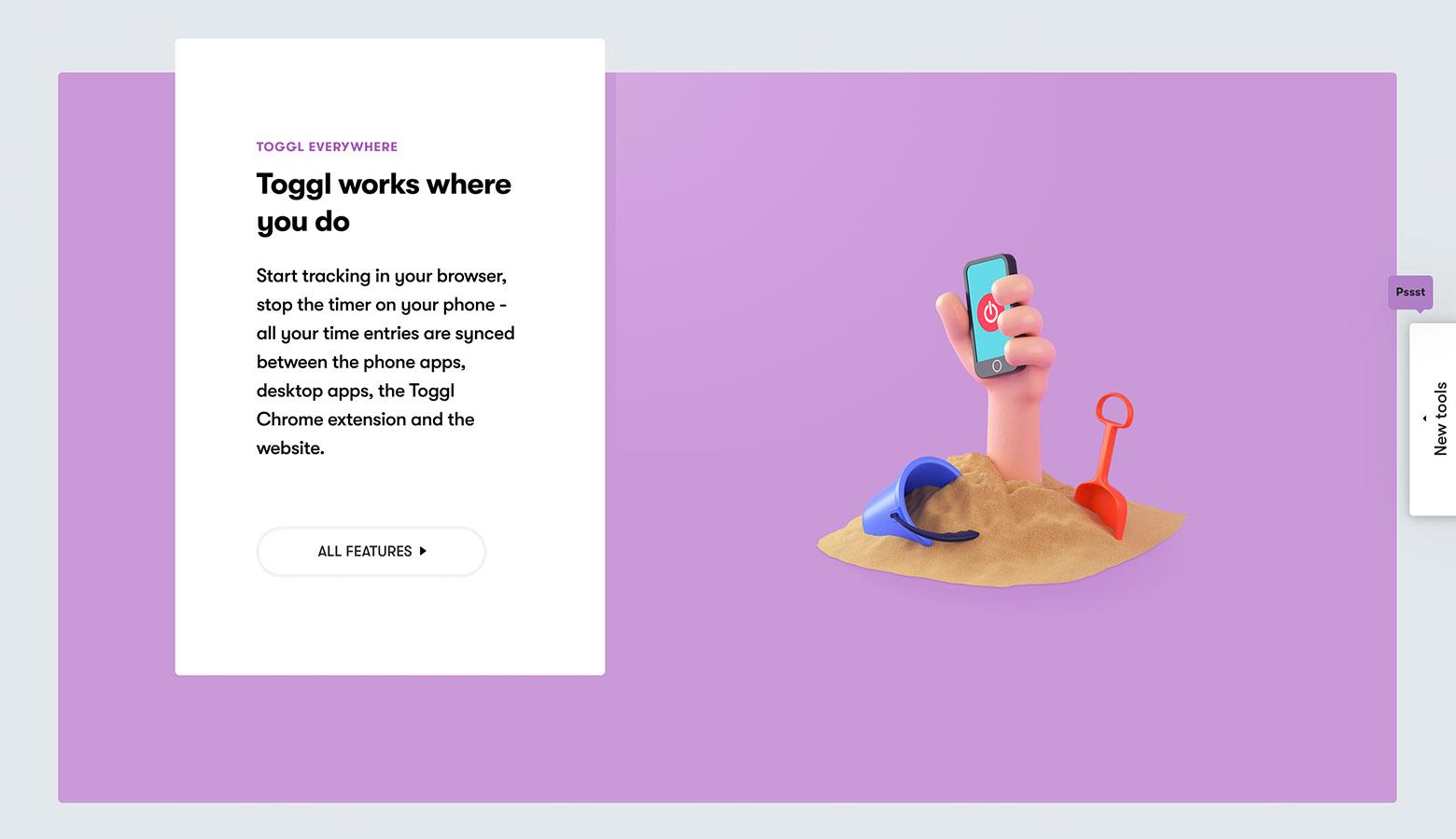
Job Well Done: Toggl
Culprit 3: Illustration Systems Get Old and Stiff
The Origin
Ours is an era of design system obsession, one stemming from the need to maintain consistent experiences at multiple brand touchpoints. Not that design systems are new. Editorial systems have been around for more than a century, but systems thinking is pressing given the number of digital channels that brands now utilize.
Likewise, brands have employed distinct illustration styles for decades, but modern-day design systems introduced a new consideration: How do we make our illustration style systematic?
Colors, textures, aspect ratios, and body types are carefully defined. The results are showcased to much fanfare. Time has revealed a flaw.
The Problem
Illustration and interface design aren’t the same. When a design system informs the style of an interface, the result is a blissful cohesion that orients users within their digital surroundings. Information architecture is a landmark. Navigation is a habit. But a system-led illustrative style suffocates creative impulse—that sudden ignition of new ideas frantically captured and refined.
It’s not that systems are inherently bad. When systems work in support of image concepts, illustrators may actually find the constraints liberating. But when images are conceived through the lens of a system, ideas weaken as illustrators rest in the false confidence of cohesion: It fits the system, so it works!
Gradually, more effort is directed at system maintenance. Lineweights and articles of clothing overrule compelling concepts. Finally, the style and storytelling ability of illustration withers and dies.
The Remedy
Illustration translates the complexity of human ingenuity and emotion. It invites outsiders to appreciate experiences that they may not be accustomed to. Illustration’s ability to be a vehicle of brand identity is secondary. These mustn’t be reversed.
To prevent images from growing stiff, build illustration systems on thematic principles. A brand’s voice and values aren’t just sources for stylistic decisions. They are storytelling strategies that can be viewed, interpreted, and re-told from multiple perspectives—the customer’s, the company’s, and the competition’s.
There are practical steps that guide the development and long-term relevancy of illustration systems:
- Don’t obsess over rules and details that the average viewer won’t notice.
- Avoid enforcing system guidelines in a way that undermines creative intuition.
- Don’t lock systems into the same color palettes as the brands they represent.
- Occasionally break the system and challenge viewers by inviting outside illustrators to contribute their own unique styles.
- Plan for the system to evolve, and allow for incremental experimentation—even when the current style is well received.
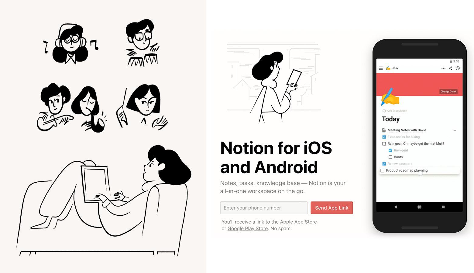
Job Well Done: Notion.so
Culprit 4: Stock Illustrations Are Overused
The Origin
Many companies require massive amounts of visual content on their websites, but time and budget constraints limit the number of custom graphics that can be commissioned. To fill the need, companies turn to stock sites where they purchase themed sets of illustrations.
Unfortunately, it’s rare to find stock illustrations that are original, high-quality, and underused (not to mention on-brand).
The Problem
A troubling trend has surfaced in the world of stock illustration. In what may only be described as a misguided tribute to the clipart era, there are now mix-and-match illustration sites that instantly generate “custom” images by allowing users to define variables like gender, skin tone, and clothing. The resulting illustrations are a stain on the creative credibility of the companies that use them.
The Remedy
For companies with limited resources, there are two ways to circumvent the phony vibe associated with stock imagery. The first may come as a surprise. Embrace stock illustrations wholeheartedly. Go all in. Use stock images without reservation but find ways to customize them. How?
- Mix and match disparate stock styles with digital collage.
- Combine stock illustrations with photography (even stock photography).
- Overlay hand-drawn elements like Sharpie marks or strokes of paint.
- Make tracings of digitally warped and distorted stock samples.
- Convert stock to grayscale and infuse on-brand colors with digitally drawn graphics.
The second way to avoid stock while working on a budget is to prioritize which illustrations are needed most and order a small set. Maybe this means commissioning five homepage illustrations. In the short term, they’ll provide visual impact, and later on, they can be used to inform a larger set of illustrations for other channels.
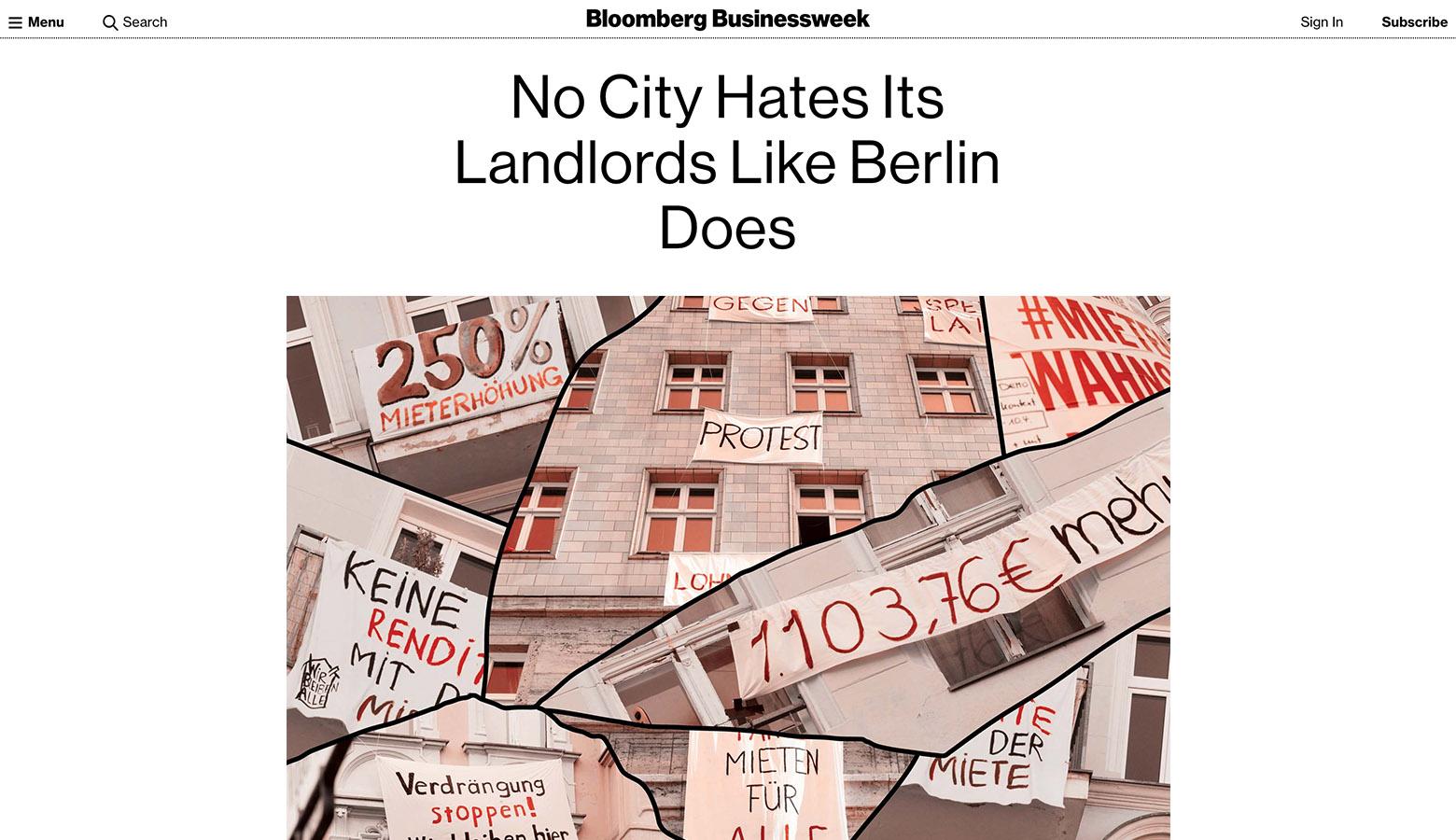
Job Well Done: Bloomberg Businessweek
Create Web Design Illustrations with Purpose
Web page illustration makes services more relatable and products more desirable. It strengthens brand storytelling and helps website visitors make sense of the never-ending streams of information they encounter on a daily basis. But merely having illustrations on a website isn’t enough.
Illustrations that fail to go beyond 1-to-1 representations of their corresponding text are an engagement opportunity wasted. Likewise, there’s little value in illustrations that could be mistaken as belonging to one of hundreds of other brands.
Illustrations for websites must captivate viewers with a unique point of view—stylistically and conceptually. They don’t have to be complex, photo-realistic, or bursting with color to be noticed, but they do need to illuminate something interesting about their subjects in ways that words, photos, and diagrams can’t.
Illustration is here to stay. Its communicative powers are too persuasive to be discarded. But for companies and illustrators who fail to explore illustration’s expressive potential, its value will prove fleeting.
Further Reading on the Toptal Blog:
Understanding the basics
Why is it important to include graphics on a website?
Including graphics like product photos and web design illustrations on websites is a great way to help users understand the text they’re reading. Graphics provide visual information about products, add color, and give structure to website content. Without graphics, the internet would be like an endless essay.
What are website icons?
There are many types of illustrations on websites. Website icons are simplified glyphs that are used to represent commands, notifications, and tools. Additionally, there are more detailed versions called spot icons that are used to illustrate services and product features.
What are icons used for?
Icons are abstractions. They simplify objects, ideas, and commands into graphic symbols that may be quickly identified by the human eye. Icons are one of the leading web illustration trends because they help users perform desired tasks and quickly find what they need on a website.
What is the purpose of illustration?
Illustration helps users perceive reality in a way that is familiar yet delightfully uncommon. It is useful when an idea, product, or service is difficult to explain in words. Because of the vast amount of web illustration styles, it’s a powerful way to relate complex emotions quickly.
Why are icons so important?
We live in a world that’s saturated with visual information. Icons and website illustrations help us cut through the clutter and quickly decide what’s important. They keep us happily engaged with the products we use every day, and when they work well, they promote brand satisfaction.
Micah Bowers
Vancouver, WA, United States
Member since January 3, 2016
About the author
Micah helps businesses craft meaningful connections through branding, illustration, and design.