First Impressions: A Guide to Onboarding UX
Nearly one in four users will abandon a mobile app after using it just once. Good onboarding makes a great first impression, gives users a guided introduction, and can significantly improve user retention.
Nearly one in four users will abandon a mobile app after using it just once. Good onboarding makes a great first impression, gives users a guided introduction, and can significantly improve user retention.
Bree’s a passionate designer and problem-solver with 10+ years experience in product and UXUI design for web and native mobile applications.
Expertise
PREVIOUSLY AT

Imagine waking up and suddenly finding yourself at the controls of the International Space Station. You have no idea what any of the blinking lights mean, or what any of the buttons and switches are for—and you have no idea what you’re expected to do.
This is how new product users feel when they open your app for the first time. Okay, maybe that’s an exaggeration, but releasing a new tool, app, or website to users without guidance can leave them feeling stranded—lost in space.

All too often, designers forget that although they have been conducting research, mapping flows, and testing interfaces, users haven’t. A newcomer to your website or app might not know how everything works or where to find what they need, even if it seems obvious to the designer or product team.
By giving your users some hand-holding and scaffolding, you are helping to save your user from that hopeless feeling of confusion and frustration—and saving your app from the discard bin.
What Is User Onboarding?
User onboarding is a designed series of interactions and/instructions that help the user ease into the product’s experience. It can be as simple as a greeting and an explanation or as complex as a series of guided tasks for users to complete. So long as you’re providing your users with an on-ramp to the benefits of your product, you’re setting them up for success.
If you’ve ever opened up a new app for the first time and seen 2-3 series of screens with short, friendly phrases explaining what the app is for, it’s more than likely you will feel a bit familiar with what to expect before you even begin to use it. Or, if a brand new social media app guides you through creating an account, setting up preferences, and adding a few interests to start, you will be starting your experience from a few steps beyond zero.
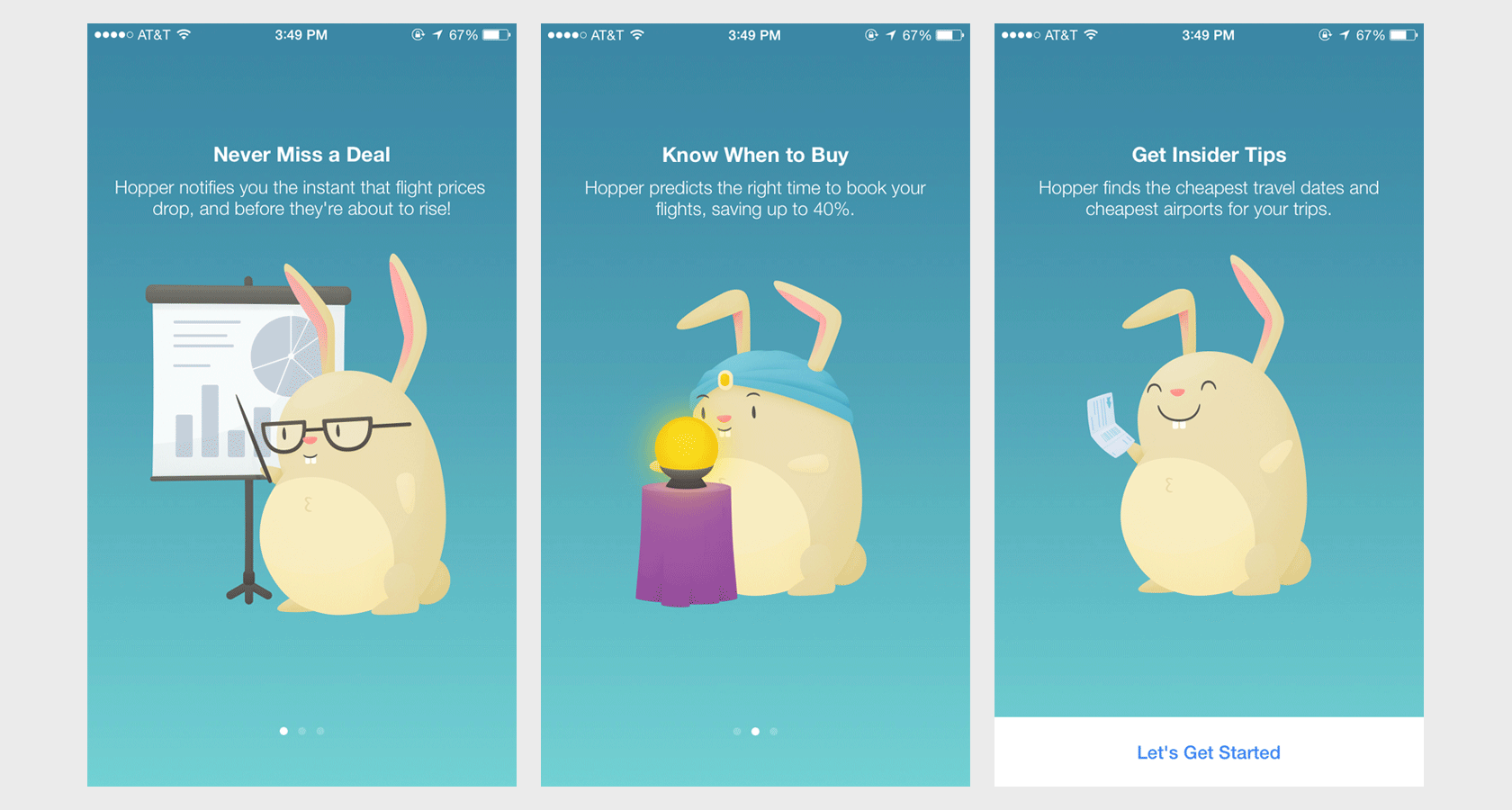
Onboarding design helps give users a sense of what they’ll need to do in order to get what they need from an app or product. It’s a way of building confidence and trust with your user, which not only helps them but is key to better conversion and retention for your business.
Why Is Onboarding so Important?
First impressions are rough. On average, nearly one in four users will abandon a mobile app after using it just once. Ouch. And once they’ve tried your app and left—they’re gone. That’s why it’s absolutely essential to give your users the right-sized app onboarding experience for your product.
While there can be any number of explanations that illustrate each individual case, it is highly likely that the users that ditched thought they would get something valuable from the app and weren’t immediately convinced.
When a user takes the time and effort to download a new app, it is highly probable that they expect the product will enhance their life in some way. Once they open the app, it’s crucial they feel rewarded for their faith in the product right away, otherwise, they are quite justified in abandoning it to try something else.
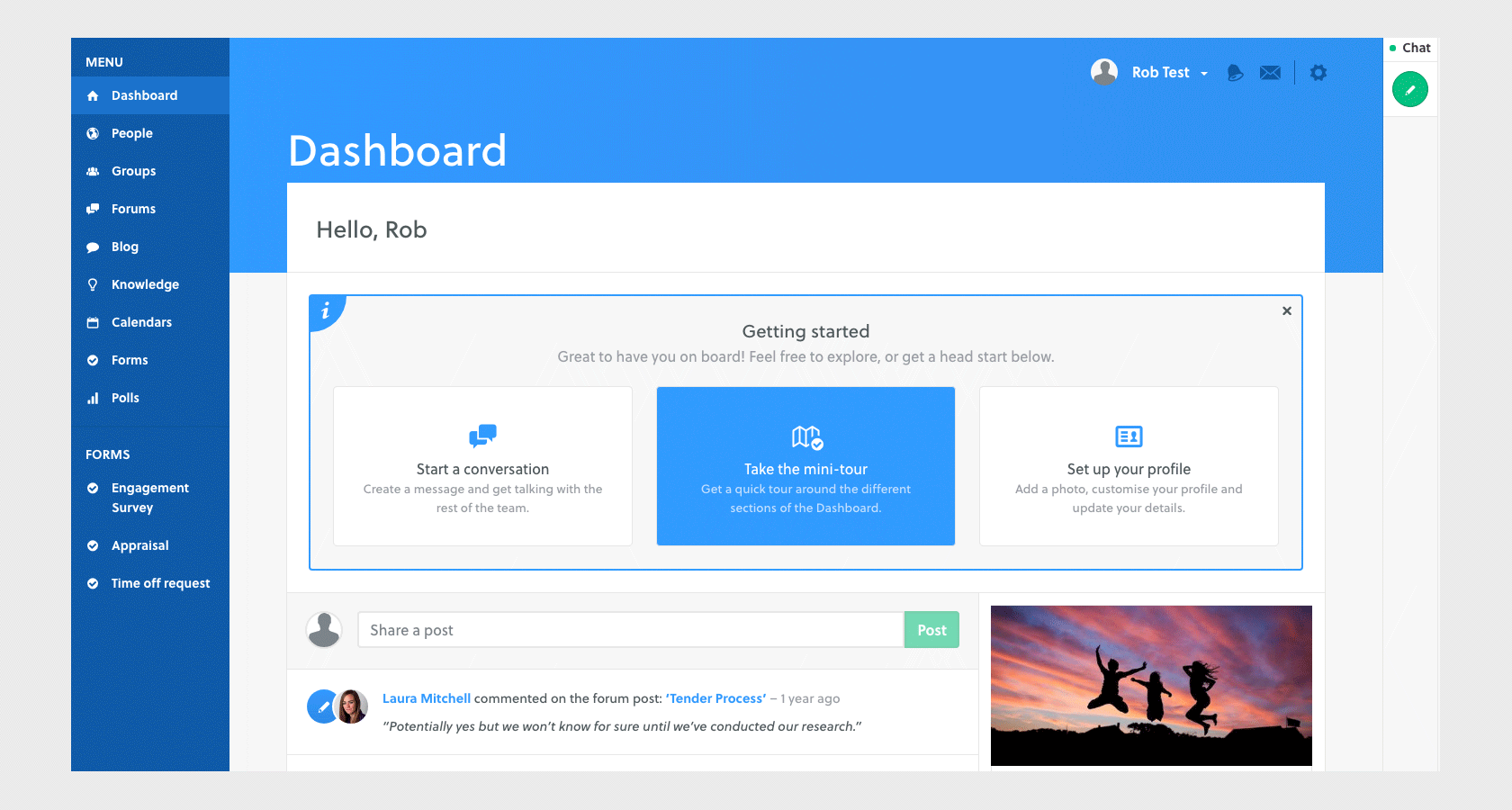
Intranet software platform Twine cut their drop-off rate of 65% by more than half by incorporating meaningful onboarding into their experience. They leveraged a multi-pronged approach to creating a richer first impression for visitors, as well as tutorials and progressive onboarding.
Onboarding also boosts long-term retention. Adding new and exciting features and tools to your product or service is great, but if people don’t know about them or how to use them, they’re of no use to anyone.
For example, the popular video sharing platform, Wistia, had some very cool customization features that were going largely underutilized by their users. After conducting careful user research, they introduced a how-to video to familiarise users with these extra features and saw a whopping 30% increase in use.
User retention and customer loyalty are major factors in the success of most apps and services. Onboarding should not be an afterthought. Instead, product teams should consider onboarding process UX at each stage of product development. Consider hiring a user onboarding UX specialist if no one on the team has that specific expertise.
Onboarding UX Design Patterns and Methodologies
Types of Onboarding
There are many ways to approach user onboarding within an app or digital product. Most products employ a combination of a few onboarding patterns in order to meet the needs of new users and retain them in the future.
The Nickel Tour
This is a common pattern that is very popular with mobile applications. Once the user has launched an app for the first time, they are presented with a few quick screens outlining the value of the app and/or some basics on how to get around.
This simple, static introduction serves as a welcome mat for out-of-box users. It should never be more than a few short phrases accompanied by simple graphics—no one wants to read a lengthy instruction manual.
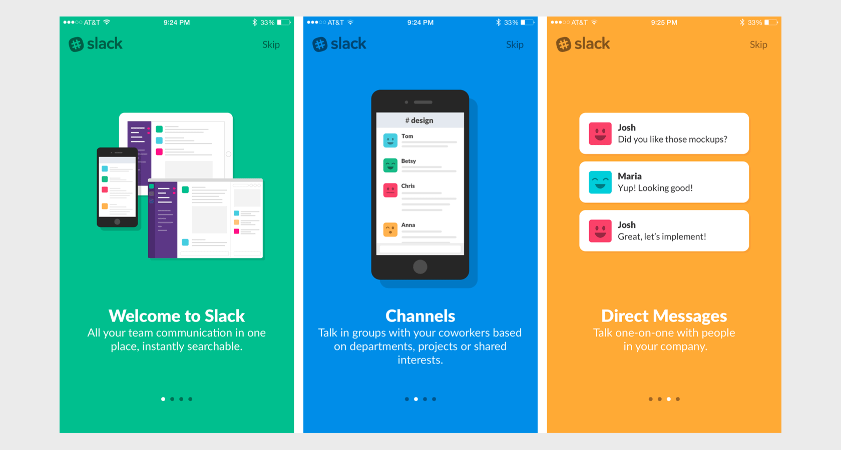
It’s a best practice to provide an indication of progress as well as an exit or skip option for your users. That way, they will understand how much of your introduction they have left to read and don’t feel trapped.
Coach Marks, Tooltips, and Guidestones
This is another very common and relatively low-effort method for onboarding users from the beginning and throughout the product experience.
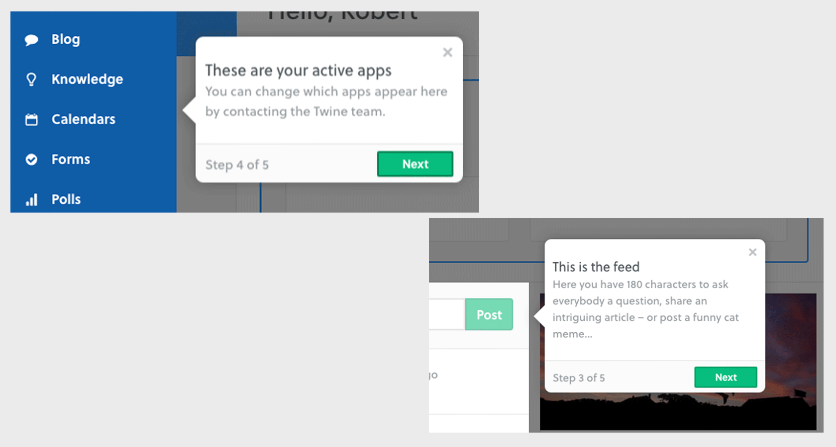
Simple UI devices that draw attention to areas of interaction, buttons, or the location of menus help alert the user to useful elements in an app or site. These are especially helpful in more complex interfaces where these items might not be immediately apparent or easy to understand.
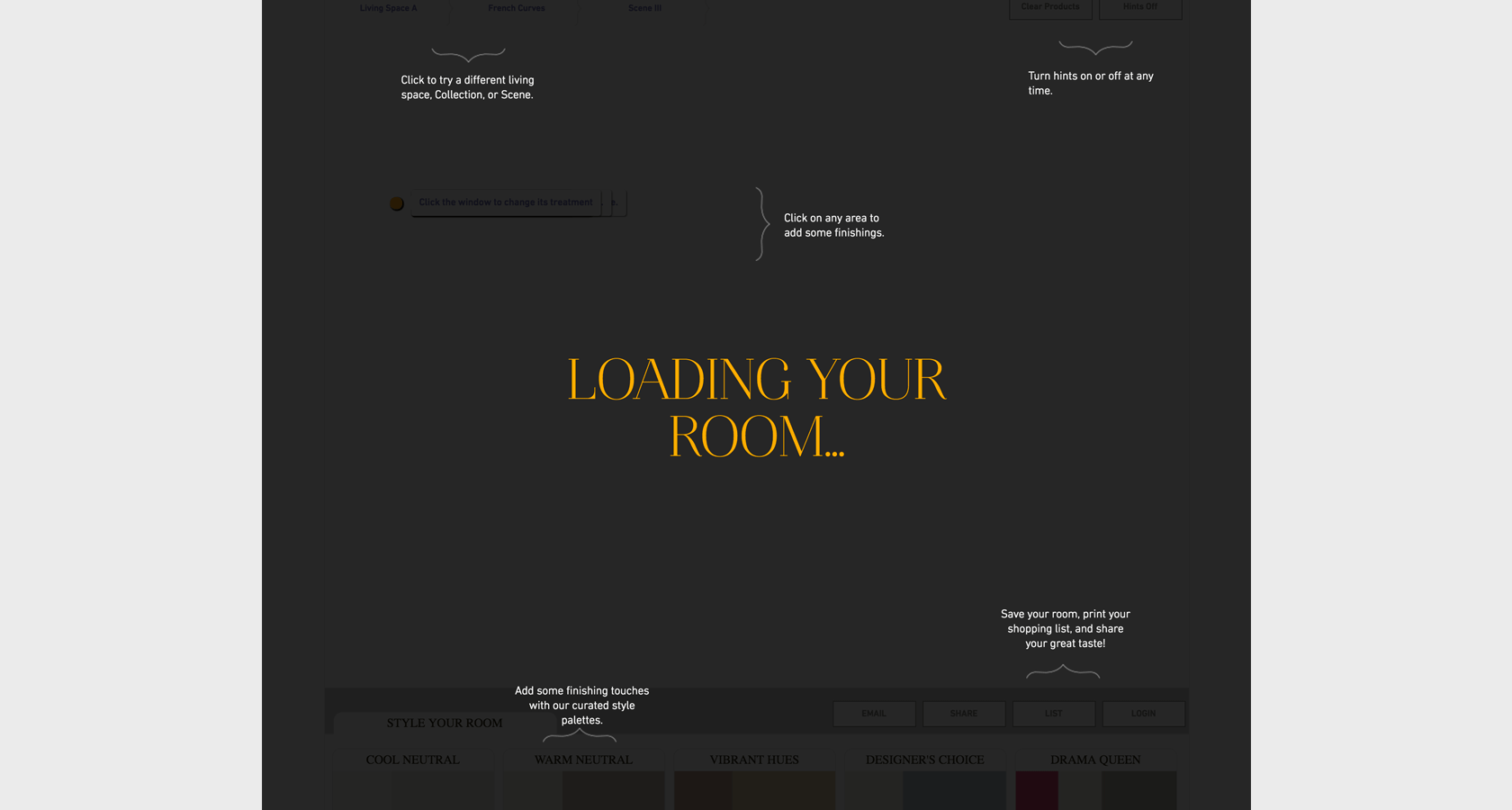
While this kind of annotated onboarding pattern is useful, be careful not to overdo it and bombard your user with tiny windows all at once. Figure out when and where tooltips or coach marks would be most useful. Guide users to one element or action at a time, and avoid explaining too much of the obvious.
Guided Task Completion
“What we have to learn to do, we learn by doing.”—Aristotle. Often, the best way for something to stick in a user’s mind is for them to actually do it.
Guided task completion is a method for prompting users to interact with the product in a series of steps. This is very common when the product wants users to create an account and/or set some personalization parameters early on.
It’s also a great opportunity to help users familiarize themselves with the menus, controls, and other aspects of your product straight away. Also, by helping the user achieve an early “win,” you’re also significantly improving the chances they’ll want to use the product again.
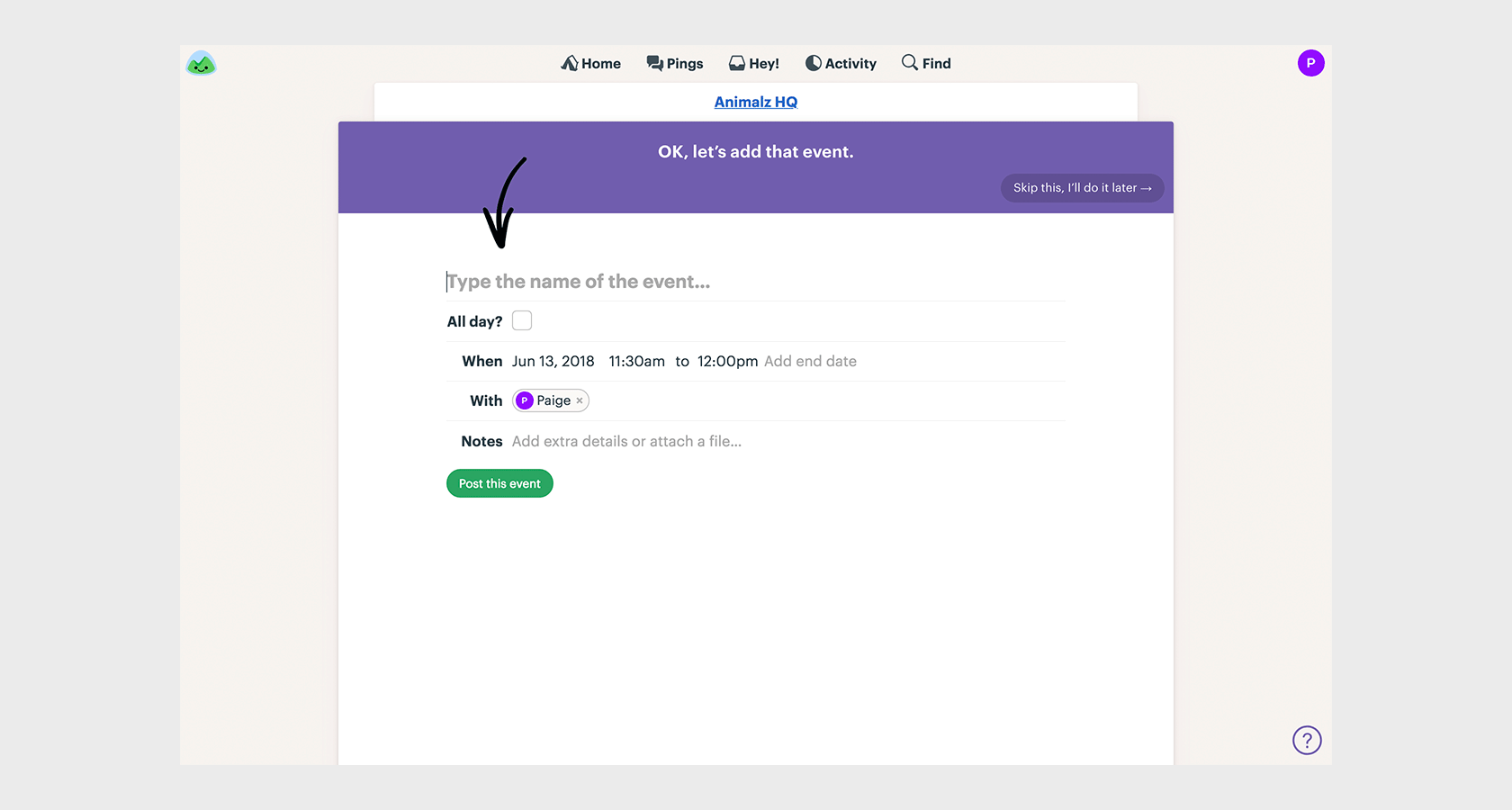
Again, it’s a good idea to give users the ability to skip this kind of onboarding when possible. For account-creation tasks, see if you can design a skippable experience to test for completion rates against a non-skippable flow to see which works best for your users.
When to Onboard Users
Deciding which UX onboarding patterns to use at which part of your product experience is crucial to “right-sizing” your onboarding user experience design. Look for opportunities throughout your user journey—from initial launch to continued usage—to give your users a helping hand.
Out of the Box Onboarding
First impressions really matter and this is the most critical moment to get right—you might not get a second chance. As was highlighted before, many users abandon an app or product after the first time they open it.
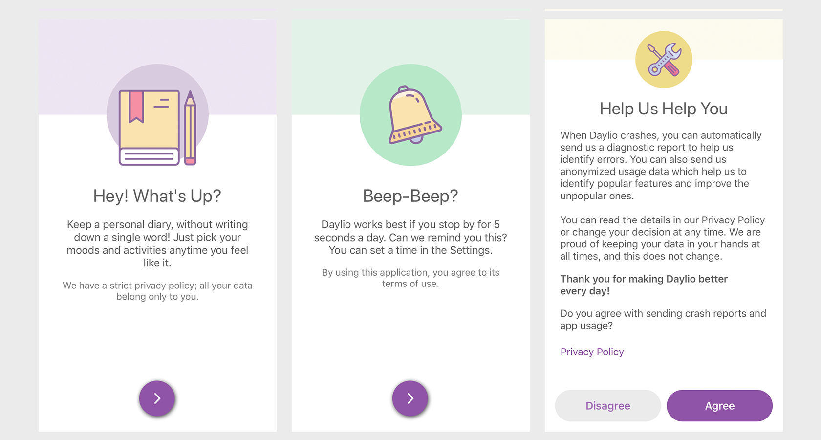
Apply user research and rigorous user testing to figure out whether the right approach for your context is a quick introduction tutorial or a deeper guided experience for first-time users.
Progressive Onboarding
This technique is designed not to leave users out to dry once they’ve completed the out-of-box onboarding flow. There are many opportunities for you to continue to help, illuminate, and delight your users. Think of it like leveling up your users in game design.
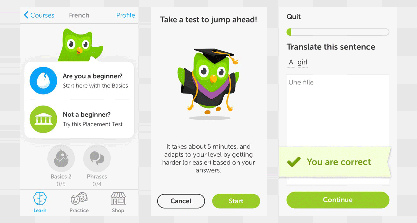
Be sure to incorporate onboarding UI patterns at intervals throughout the relationship. Remind a week-long user to complete a more advanced task that they may not have noticed. Celebrate milestones with lightweight notifications. Survey users about their experience a few weeks out to signal that you care.
New Feature Onboarding
This is a bit of a mix of new user and progressive onboarding. When you launch a new feature or make any major changes to the experience, let your users know what’s great about it and how to utilize it.
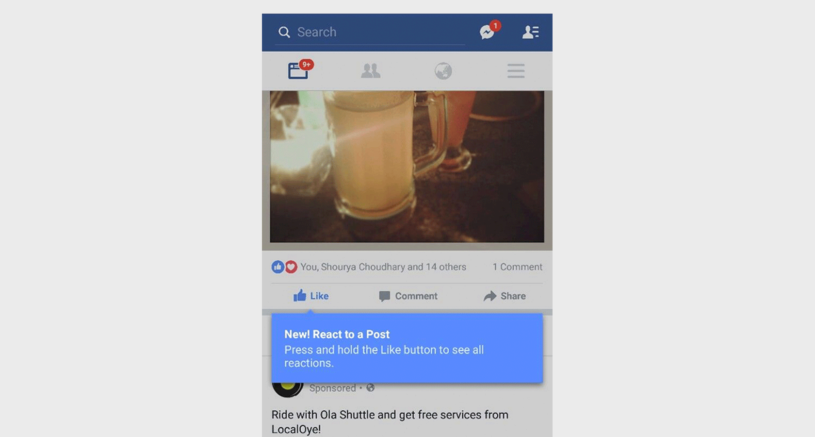
A great way to point out new features is through the use of tooltips and coach marks, which help guide the user’s attention to the location of their new app superpowers.
Onboarding UX Best Practices and Tips
Understand Your User
The onboarding style for a brand new product on the cutting edge of technology will likely be different than something familiar like a calendar or note-taking app. Look at the personas the team has developed and decide what makes sense to them. Right-size the onboarding experience by understanding the user, and tailor the user onboarding experience to the target personas.
Discover and leverage your users’ existing mental models in order to help bridge any gaps in what they expect from your app or website. Know what signifiers your design can rely on vs innovations that may be confusing at first blush.
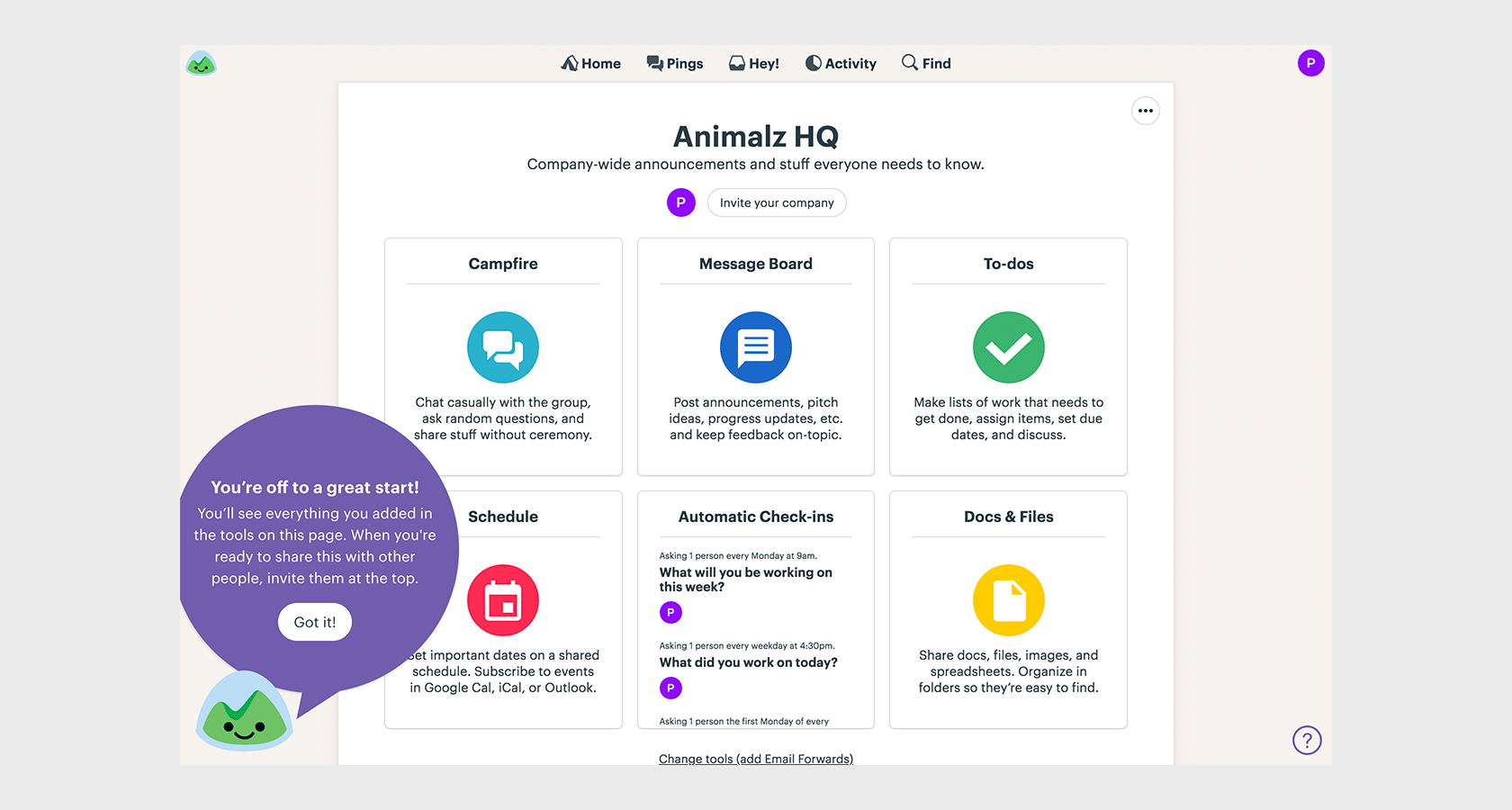
User research will help your team build empathy with your core audience. As you build your product, frequent user testing and usability analysis will help your team not only make improvements to the overall design but will inform which areas to focus on with user onboarding.
Balance qualitative user research with metrics that will help illuminate issues in your onboarding experience. For example, if you notice a significant abandonment during a preferences-setting onboarding experience, check in with your users. Maybe the experience is too heavy or too personal; maybe they want to get to the good stuff sooner and you can make adjustments to the flow.
Tie Onboarding to Value for the User
Your out-of-box onboarding UX should be focused on getting the user to a wow moment of satisfaction as seamlessly as possible. Single out the core value proposition for your user, and find a way to communicate that first.
Use the benefits introduction onboarding to remind users why your app or service is the best to meet a specific need. If your onboarding flow involves personalization, explain to users why you’re asking them questions about their personal preferences or situation, and how it will enhance their experience.
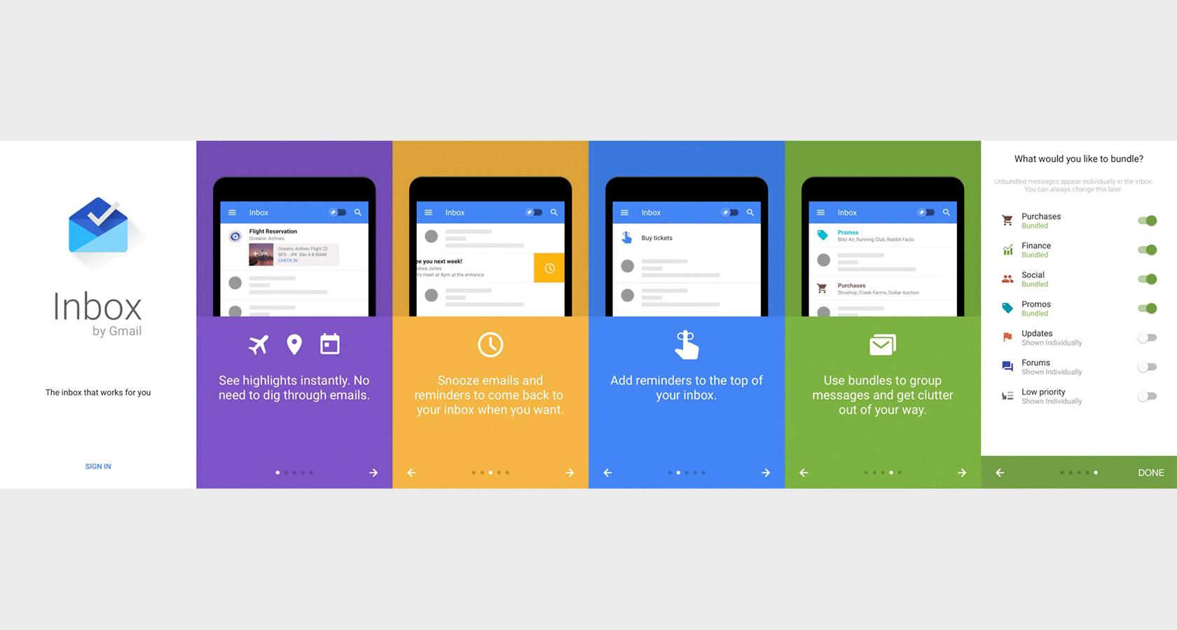
Onboarding or instruction that is not immediately tied to value for the user, such as a neat-but-not-critical feature can be introduced later in the app or through lighter-touch onboarding. It’s good to let users know about extras, but if it’s not essential to the core experience, it’s not as important to the introduction.
Make It Quick and Painless
“The main thing you need to know about instructions is that no one is going to read them—at least not until after repeated attempts at ‘muddling through’ have failed.”
― Steve Krug, Don’t Make Me Think.
While you don’t want to strand your user in an unexplained field of confusing buttons and toggles, you also don’t want to force them to sit through multi-step instructions that feel like work. Does anyone even open instruction manuals anymore?
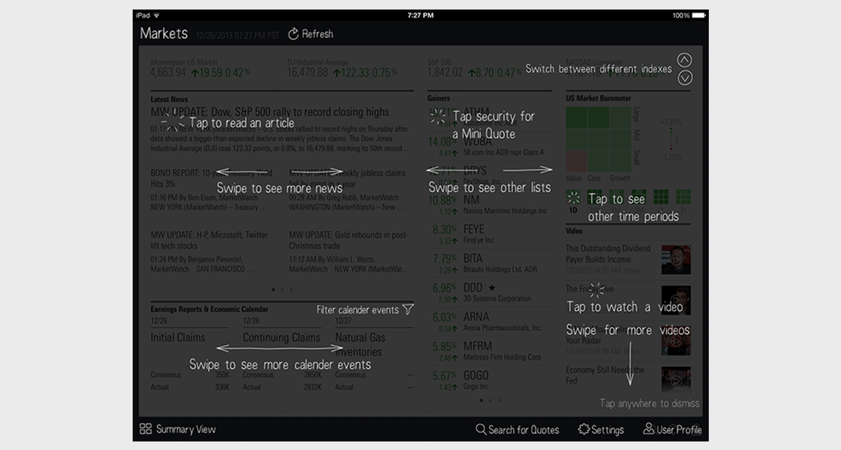
Again, the heft of your onboarding experience should correlate to insights from user research and the complexity of your product. But even for brand new, innovative technology, you don’t want your users to become bored or intimidated with a lengthy preamble.
If the app or product is simple, a quick introduction and handshake is likely enough. When more depth is needed, consider adopting progressive onboarding that spreads the onboarding across the app experience, dipping in and out as needed to provide guidance and scaffolding.
Also, allow users to skip or delay onboarding if they want. If your app introduction is 4 or more screens that the user has to swipe or click through, the skip button can make a world of difference.
Make It Repeatable
Don’t forget to give users a way back into any guides or walkthroughs you’ve shown them—especially if you’ve followed UX onboarding best practices by making your introduction tutorial, or other onboarding patterns, skippable.
You cannot assume that your users won’t ever want access to your instructional videos or interface tour again. They may have forgotten one or two clever tips mentioned in the first-time onboarding—or find themselves lost after impulsively skipping the whole thing.
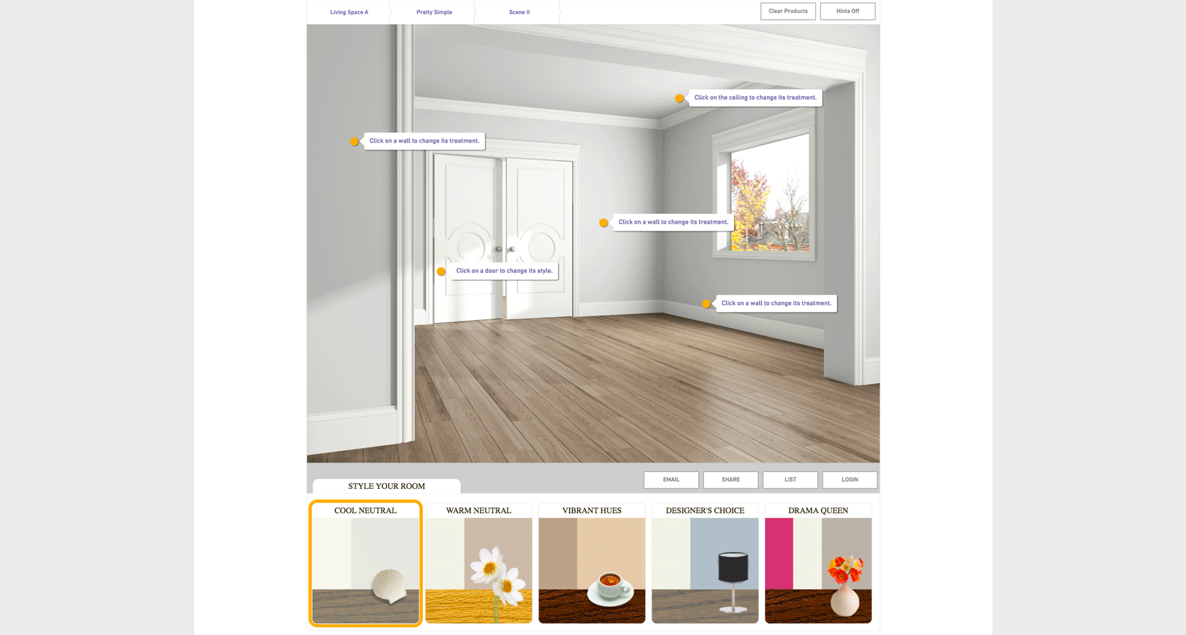
Include a “help” section in your navigation that includes a pathway to repeat any onboarding that may have slipped your user’s mind.
Don’t Get Too Personal
Long forms that ask too many questions are user bounce machines. It’s nice to encourage a brand new user to provide some information that will help personalize their experience, but it’s important to not get creepy by asking for too many details.
In a time when privacy is becoming more scarce and personally valuable, you should not be asking a ton of unnecessary questions, especially at the beginning. Some apps require users to set preferences or make decisions before being allowed to use an app, which is a terrible idea.
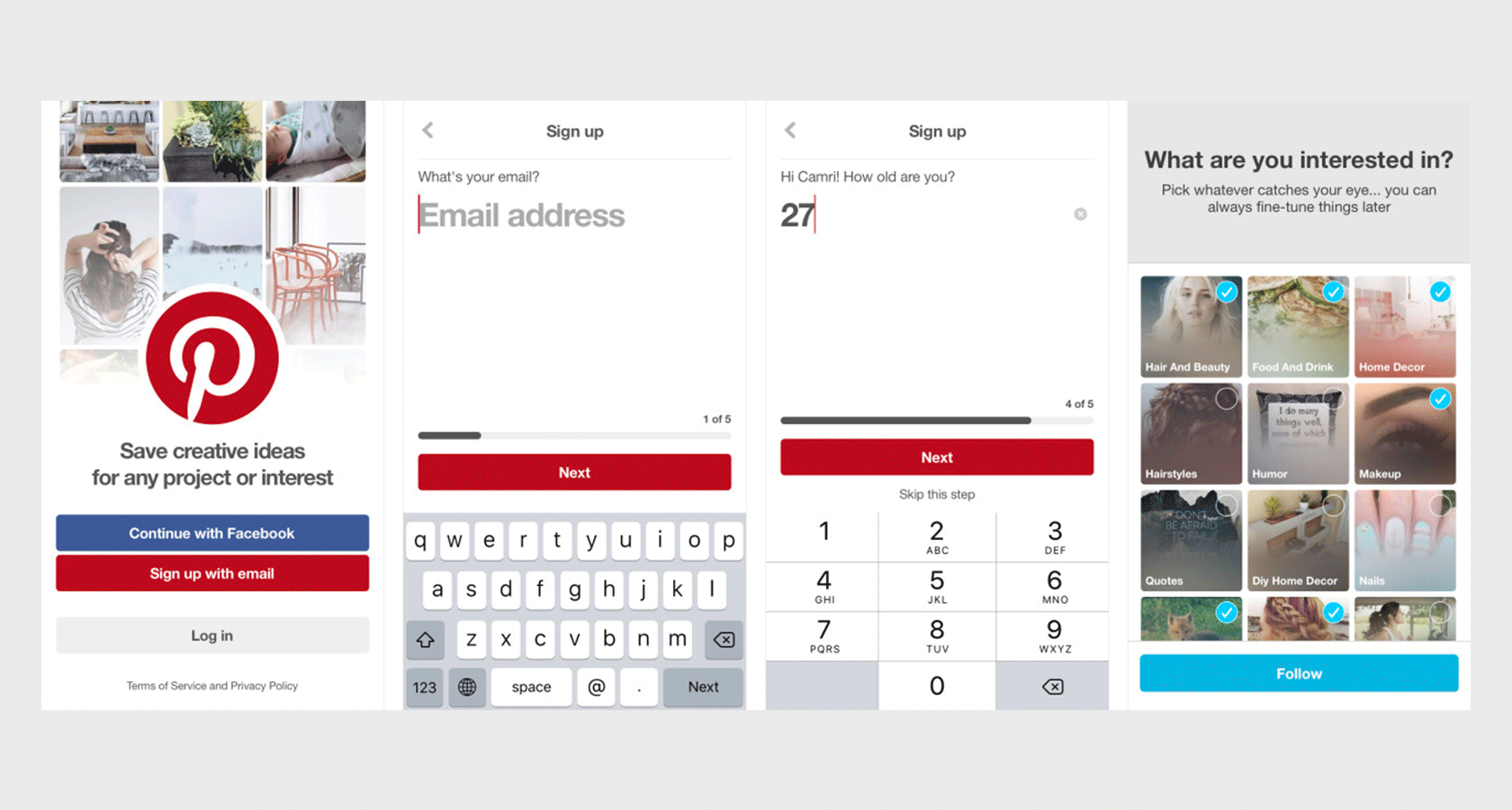
Remember, you can always fold this kind of information-gathering into the experience at later stages. Build trust with your user by inviting them in and allowing them to look around before trying to find out more information—you won’t get much data from a user that abandons immediately.
I was once hired by a shopping platform to help them reconfigure their onboarding experience in order to improve conversions. By comparing the first time user experience flow with the data from analytics, it became obvious that the drop-off was happening during screens that were asking the user to provide a ton of personal information, as well as make some seemingly final preference choices up front.
While this information was valuable to the business and would help personalize the experience for users, they were abandoning the signup process. We decided to cut information requests down to just an email. We also reduced the shopping preference questions from 8 to 3 and allowed users multiple choices and the option to skip. This resulted in an over 30% reduction in the bounce rate almost immediately.
Don’t Rely on Tutorials to Cover for Bad UX
Remember: even with onboarding, your app or website should still make sense and be as clear as possible. Onboarding is scaffolding, not a crutch for bad design.
Too many confusing—frankly, just bad—products and apps have tried to cover up poor design decisions by bombarding their user with lengthy instructions or a barrage of tooltips. This is not good design practice and will not keep your users coming back.
If you’re finding your app or product continues to be unusable as you layer on heavier and heavier onboarding patterns, it’s time to take a cold, objective look at your core design and start making improvements there.
Onboarding Services
If you approach your engineering team with a stack of ideas on adding guided task completion to your project, you might come up against a good deal of resistance. Complex onboarding patterns require a lot of dev effort and can present their own minefield of technical concerns.
Luckily, there are a growing number of services and platforms that provide painless UX onboarding. Here are a few to check out:
- Walkme is a popular service that provides a wealth of tools to build walkthroughs and tutorials as well as track onboarding performance.
- Appcues gives app teams tools to layer on an onboarding experience for their product with a lot of customization and tracking.
- Nickelled helps you create guided tours and overviews of your website or service will tooltips, coach marks, modals and more.
It’s a good idea to invest some time and research into crafting the appropriate onboarding UX patterns for your users. Incorporating the right onboarding UX for new and existing users alike is essential if apps and other digital products are to retain and fulfill their user’s needs.
Onboarding is not about just one moment, it’s a journey that establishes and maintains trust with your audience. A great onboarding experience will help your users use your product to build habits that rely on its features as an important part of their lives.
Further Reading on the Toptal Blog:
Understanding the basics
What is an onboarding experience?
An onboarding experience is a way to introduce users to a new product, app, or feature. Onboarding UX is the design of a flow or series of flows that give the user a guided introduction to the product, set up some initial preferences, or point out critical UI elements in an interface.
What is an onboarding flow?
A first-time user onboarding UX flow is one that introduces the product, app, or feature to a user. The onboarding flow may also involve guiding the user through completing a few tasks, such as setting up an account or setting preferences.
What does user onboarding mean?
User onboarding is a process of using onboarding UX patterns to introduce users to new apps, products, or features. By providing a good first-time user experience, designers can hope for better usability and user retention.
Bree Chapin
New York, NY, United States
Member since May 15, 2016
About the author
Bree’s a passionate designer and problem-solver with 10+ years experience in product and UXUI design for web and native mobile applications.
Expertise
PREVIOUSLY AT

