Boosting Satisfaction and Sales: An E-commerce Checkout Design Case Study
Improving your checkout flow can dramatically increase conversions and user satisfaction. A veteran UI/UX designer explains how she reimagined the checkout process of the seventh most visited e-commerce site in the US.

Beatriz is an art director and a UI/UX design leader with extensive experience in e-commerce and digital product design for clients like the large American retailer Belk. She specializes in leveraging user personas, customer journeys, and user story mapping to create products that resonate emotionally.
Previous Role
Creative DirectorPREVIOUSLY AT

In 1888, 26-year-old William Henry Belk opened a store that would later grow into America’s largest privately owned department store chain: Belk. Today, the company has 290 locations, mainly across the southeastern US, and Belk.com is the seventh most visited e-commerce and shopping site in the US. But even a successful retailer like Belk faces digital challenges. The average global cart abandonment rate across e-commerce retailers is a whopping 70%, according to 2024 data from the customer experience researchers at the Baymard Institute. The institute also posits, based on usability testing, that the average large-scale e-commerce website could make nearly 40 improvements to its checkout flow—an effort that could result in a 35% conversion rate increase.
To get ahead of these industrywide challenges, Belk’s management team called for a six-month e-commerce overhaul, including redesigning the shopping and checkout experiences. As part of this broader initiative to streamline the purchase funnel, I was asked to reconsider the shopping bag experience (i.e., how customers review their selections prior to buying) and the subsequent checkout flow, during which users provide shipping and payment details.
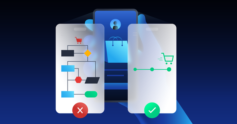
The redesigned site is a vivid illustration of how empathizing with users’ needs—in this case, those of a largely older audience—can lead to an improved e-commerce experience that boosts customer satisfaction, conversion rates, and sales.

The E-commerce Checkout Challenge
Belk’s executive team wanted to release an MVP (minimum viable product) in six months, a feasible but aggressive timeline. The team had already developed a fairly deep understanding of the company’s user base, so the design process grew out of existing analysis rather than new user research. Belk informed designers that the company caters to an audience that is nearly 80% female, with its largest customer base between the ages of 55 and 64 years old. What’s more, 65% of Belk’s customers are 45 years or older, 46% arrive on the site via direct traffic, and the average visitor views 5.19 pages and stays on the site for more than four minutes.
To complement this existing research, I analyzed the sites of competitors like Nordstrom and turned to the Baymard Institute to review best practice examples of cart and checkout use cases and design patterns. I also drew on my experience designing and launching table linen brand Prado y Barrio and a previous project designing a loyalty app for Etos, one of the largest drugstore chains in the Netherlands. Both roles exposed me to a crucial e-commerce principle: Removing unnecessary steps from the customer journey is essential.
Examining Belk’s website, I determined that the checkout flow had too many pages and too much text, the call-to-action (CTA) buttons were inconsistent and not ideally positioned, and there weren’t enough images to help buyers see and understand what they were purchasing. For the target audience of middle-aged and older users—who, as a cohort, often have difficulty seeing at close range due to farsightedness and conditions like presbyopia that can develop later in life—these issues were particularly problematic. These problems are only compounded on mobile screens.
My key objective in the checkout redesign was to simplify the flow of screens, page elements, and interactions users encounter as they review items in their bags and proceed to checkout. The changes specifically target older users, though I believe they will make the experience more user-friendly and intuitive for everyone. As a deliverable of the design effort, I shared prioritized recommendations for usability changes across Belk’s mobile and desktop shopping funnels.
Streamlining the Shopping Bag Experience
For the shopping bag experience, our main goal was to simplify the page and guide users to perform a key behavior: double-checking that the products in their bags were the right size, style, color, and quantity. Anyone who has ever had a pair of laughably ill-sized pants arrive on their doorstep or booked a flight for the wrong date understands why this step is so crucial. And returns represent a major loss for retailers: In 2023, customers returned $743 billion worth of merchandise.
Pre-overhaul, the Belk site offered the option to review bag contents, but the design suffered from three problems:
- Promotional offers cluttered the screen, distracting users from their primary goals.
- Product images were too small for some users to see.
- A bag editing button let users change their order selections at every step in the flow—rather than at the end of the process when they were ready to check out.
Increasing the thumbnail image sizes was an intuitive decision—we buy with the eyes. But our recommendations to rid the site of clutter and restrict the editing menu to the confirmation screen came as a response to the so-called “paradox of choice,” a term derived from a body of research that shows having too many choices can lead to paralysis and leave people less happy with what they select.
One seminal study by researchers Sheena S. Iyengar and Mark R. Lepper found, for instance, that when grocery shoppers were given too many gourmet jam choices to purchase from a display table (i.e., 24 jam choices as opposed to six), they were less likely to purchase any jam at all. It’s a surprising finding that has been embraced by fast-casual restaurants with limited menu options such as Chipotle and—increasingly—digital product designers.
Taking the spirit of these lessons to heart, we made several tactical recommendations to the My Bag page to reduce abandonment and amplify the CTA by removing distractions. These included:
- Collapsing the search bar in the mobile display of the My Bag page to limit abandonment and add scroll depth.
- Reducing the size of a Belk credit card campaign banner and allowing users to close the window entirely if they’re not interested.
- Auto-collapsing color, size, quantity, and shipping details into a single, uncluttered container with +/- selections for quantity changes.
- Presenting express checkout payment options later in the purchase flow, after the user has progressed to checkout.
- Adding the option to edit the bag’s contents with a modal (lightbox) that requires user engagement and eliminates the need to return to the product list page.
- Using a sticky CTA button at the bottom of the mobile screen to nudge users through the shopping funnel.

Reimagining the Checkout Flow
For the checkout experience, our primary objective was to condense information spread across three unique pages—shipping details, payment information, and order review—to a single, scrollable page.
The 80-20 rule, also called the Pareto principle, helped drive our decisions about what content options to prioritize in the design. In short, the rule posits that 80% of business outcomes are the result of the same 20% of causes. Applied to Belk’s mobile and desktop checkout pages, these “causes” boil down to accessibility and how easy it was to view and adjust order details, contact information, payment details, shipping locations, and arrival speed. This is where we directed our energy.
Taking cues from Belk’s high-converting mobile app, we created separate checkout flows for guests and logged-in users. This allowed us to better tailor the checkout experience. Guest users, for instance, are unlikely to have Belk Rewards Dollars certificates, so we reduced the size of those fields in the guest checkout.
For logged-in users, our focus was to keep all relevant order details above the fold. On Belk’s previous site, these details were displayed in multiple sections and required users to jump-link past key information to place an order. Our revised design includes the thumbnail image, estimated delivery date, and order price on a single page. This makes it easier for users to see all at once what they’re buying, how much their order will cost, and when they can expect it to arrive on their doorstep.
After customers have spent time searching for a new swimsuit or pair of sandals, they don’t want to spend more time scrolling around for the Buy button. A sticky Place Order CTA pinned to the bottom of the checkout page that stays in place no matter how far down the screen the user scrolls encourages them to complete their purchases. With their contact information, address, and payment information saved, there is no reason to ask for this info: Logged-in users can complete checkout in two clicks.
In a snapshot, our key recommendations included:
- Reducing a three-page, multistep checkout process to a simple one-step checkout.
- Adding a sticky CTA to the bottom of the mobile and desktop screens to keep the user’s goal in mind and encourage funnel progression.
- Consolidating form fields (e.g., email, phone number, ZIP code, city) to improve scroll depth.
- Incorporating titles with large, legible text fonts inside input fields to improve accessibility.
- Displaying an above-the-fold order summary with thumbnail images, order price, and fulfillment details.
- Defaulting to credit card for guest payment, and providing alternative options for PayPal and Afterpay.

Coding Design Solutions
Many of the options the new checkout flow offers customers—including in-store pickup, same-day delivery (in some regions), and dropshipping—required the development team to reconfigure algorithms and write discrete code strings to respond to edge cases and geographic dependencies. One of the core challenges of the redesign was to accommodate multiple payment and fulfillment options into the source code.
For instance, while standard shipments can reach anywhere in the US within 15 days, same-day delivery is only available for customers in select ZIP codes. Belk’s e-commerce team has done a good job budgeting time to accommodate such nuances, which are crucial to the customer experience but require fairly sophisticated software engineering to execute.
At the workflow level, achieving such a high level of user customization has meant near-constant communication between the design and development teams. A Figma page of added scenarios was my largest file for the project, and I compared notes with the engineering team nearly every day to optimize the UX of gift card purchases, alternative payment options, and other scenarios.
Another challenge was that, while Belk’s e-commerce site functions as a marketplace for third-party retailers, free and discounted shipping incentives aren’t always available for these retailers’ products, which also fall under different return policies. Distinguishing them as “marketplace products” with an accompanying label was important to bring clarity to the purchase process and, hopefully, avoid misunderstandings that can frustrate users and damage their trust.
While we did our best to accommodate edge cases, in some instances, keeping things simple and cost-efficient required hard choices. Originally, we had wanted to give users a way to split a shipment—say, routing one of two pairs of slacks to a home address and the second pair to a work address. But conversations with the development team and further market analysis revealed that the convenience the feature would bring to a tiny subset of users failed to warrant the considerable time and staffing expense it would require to code.
If there’s a lesson here, it’s this: Convenience may be the linchpin of e-commerce, but how you deliver it should be based on user behavior and never pursued so zealously it cannibalizes other aspects of your business.
Collaboration Breeds Confidence and Trust
E-commerce checkout is a realm of digital design that calls on open collaboration from stakeholders across an organization. In this case, dialogue between the design and development teams brought to light solutions neither group would have arrived at on its own, such as how to geographically segment options for same-day shipping. Lengthy conversations with the marketing team led to equally important revelations. Promotional banners, for instance, can be an effective sales tool, but if inappropriately placed or too greedy for screen real estate, they can aggravate customers and kill sales. Here, the solution was a compromise: We kept the banners, but shrunk them so they didn’t push the CTA below the fold.
Striking the right balance in these ambiguous situations requires a holistic approach and open communication across teams. Sometimes you need to push hard to advance your ideas; other times, it’s best to listen.
The media and measurement firm Ovative Group conducted a three-month audit of Belk’s redesign in early 2024 and made only minor suggestions for improvement, so we launched the approved changes to the desktop and mobile shopping bag and checkout pages—and Belk customers are responding well to the streamlined experiences. For me as a UI/UX designer, this project underscored the business value of designing an intuitive, user-friendly e-commerce checkout experience. Investing in thoughtful digital design—or redesign—can help brands avoid the widespread problem of cart abandonment and enable more customers to complete their purchases.
Further Reading on the Toptal Blog:
Understanding the basics
What is a checkout flow?
In e-commerce, the checkout flow is a series of steps that a customer undertakes to finalize a purchase on a website. For the customer, this involves reviewing their chosen items, entering shipping and payment details, and selecting their preferred shipping method before confirming the order.
How can I improve my checkout flow?
Improve your checkout flow by streamlining the process and minimizing the number of checkout steps required to make a purchase. For instance, you can reduce unnecessary clutter (such as banner ads) displayed during checkout and ensure that all of the key information is clear and visible above the fold.
What is the one-step checkout process?
The one-step checkout process is a streamlined method of making an online purchase. Instead of having multiple pages for completing checkout steps, such as entering a shipping address, inputting payment information, and reviewing the order, all the necessary fields are consolidated into a single page. This approach aims to reduce cart abandonment and make the purchasing process simpler for users.
Palma de Mallorca, Spain
Member since January 29, 2018
About the author
Beatriz is an art director and a UI/UX design leader with extensive experience in e-commerce and digital product design for clients like the large American retailer Belk. She specializes in leveraging user personas, customer journeys, and user story mapping to create products that resonate emotionally.
Previous Role
Creative DirectorPREVIOUSLY AT