Create Standout Social Media Graphics That Drive Engagement
Are users scrolling past your brand’s social media images? Try these graphic design techniques to create expert visuals that grab attention on Instagram, Facebook, LinkedIn, and beyond.
Micah is a digital designer who has worked with clients such as Google, Deloitte, and Autodesk. He is also the Managing Editor of Toptal’s Design and Technical Content. His design expertise has been featured in Fast Company, TNW, and other notable publications.
Previous Role
Digital DesignerPREVIOUSLY AT


Social media thrives on visual appeal. The look of your company’s posts is crucial in differentiating your brand from competitors and capturing audience attention. Anecdotally, you know this to be true from countless hours spent scanning your own social feeds—the scrolling doesn’t stop until an image attracts your eye. Your audience behaves the same way. But creating social visuals that ignite these captivating moments can be difficult, and your window to grab attention is short: The brain can process visual content in as little as 13 milliseconds, according to MIT research.
Without a clear strategy, you may end up creating social media graphics that are too busy, lack a clear call to action, don’t speak to your audience’s needs, or simply don’t catch the eye. Leveraging graphic design principles can help brands support their strategic messaging and create visuals that resonate on major social media platforms like Instagram, Facebook, and LinkedIn.
As a graphic and brand designer who has partnered with startups and global brands to produce diverse social content, I’ve seen how powerful it is when design best practices amplify stories and calls to action, driving engagement and brand recognition on social media. Here’s how to make social media graphics that cut through the noise.
Graphic Design for Social Media: Why Does It Matter?
Graphic design is more than the creation of aesthetically pleasing images; it’s about organizing information so that the most critical visual elements stand out and communicate a message. Applying graphic design best practices to social media design can shape audience perceptions and boost engagement.
For instance, layout strategies like symmetry, repetition, and emphasis make content easier to digest, and graphic elements like icons, illustrations, and visualizations help audiences quickly make sense of complex information. Graphic designers should work with brands to align on their desired crucial messages and takeaways in order to create visuals that achieve the company’s goals.
Graphic design also aids storytelling and encourages audiences to follow along with a brand’s social accounts. Companies often weave narratives through multiple social posts connected by consistent visual elements, such as recurring graphics, typefaces, or illustrations. Such consistency builds anticipation and primes audiences for emotional connection—the bedrock of engagement. Graphic design principles, such as hierarchy and proximity, can also prompt viewers to take specific actions, such as sharing content, visiting a website, or leaving a comment—thereby extending the reach of your content and brand.
But perhaps the most critical way graphic design influences social media content is by building brand recognition. When your posts consistently leverage elements of your company’s visual identity, they become instantly recognizable regardless of the social platform they’re on.
A prime example of effective social media graphic design and cross-platform consistency is GoPro. On platforms like Instagram and Facebook, where static imagery thrives, GoPro’s design approach leverages its iconic fish-eye effect to showcase explorers, adventurers, and athletes in striking natural settings. Its typographic content is equally distinct and consistently features bold, white fonts against black and dark blue backgrounds, mirroring the company’s brand colors. This cohesiveness is also applied to video-first platforms like YouTube and TikTok, where the same thrilling subjects and locations appear in live action; it’s a method that ensures GoPro’s branding is easy to spot and hard to forget.
How to Make Social Media Graphics Stand Out
Creating content that stands out on social media is no simple task. Let’s examine specific graphic design strategies that can make your visuals more compelling.
A Consistent Color Palette
While more research is needed to fully understand the impact of color on psychology, studies routinely show that color influences emotions. This makes it a powerful tool for crafting visual content for social media, which is often ruled by quick, instinctive reactions that can affect conversion rates and engagement metrics such as likes and shares. In addition, consistent color usage supports brand recognition, helps establish content hierarchy, aids readability and accessibility, and emphasizes important calls to action.
While the benefits of thoughtful use of color are clear, mastering color theory is notoriously difficult because:
- Color is relative: An individual color’s appearance can change significantly based on adjacent hues.
- Color harmony is elusive: The hue, saturation, and brightness of each color in a color scheme must be carefully balanced.
- Color perception is variable: People perceive colors differently based on a wide range of environmental, physiological, and psychological factors.
Fortunately, several techniques and design skills can help companies and designers navigate this complexity. One fundamental yet crucial strategy is to stick to the brand colors. At most companies, designers have created meticulously crafted color palettes, and adhering to these colors will ensure that content is visually consistent and easy for your audience to identify. Even if the company’s palette seems dull, dated, or limiting, using it regularly will foster brand recognition.
For example, while working on content for a campaign that appeared on Yammer, a social network intended for internal use at large corporations, I initially felt like my client’s color scheme was too dark and lacking in vibrant accents. But because the campaign was internal—and highly visible to company leaders—I couldn’t stray too far from the colors outlined in the brand guidelines. At first, this felt like a limitation, but after working with the colors for a month or two, it became easier to envision ways to use the color palette creatively. Over time, the campaign generated significant interaction—which I attribute in part to its aesthetic (and color) consistency.
That said, designers should be empowered to get creative with their use of an established color palette when necessary. In another project, when working with a client in the tech space, I created a series of social media images that depicted people cheerfully using the company’s drag-and-drop website builder. The posts also included graphic elements like text, patterns, and icons rendered in the company’s mostly blue color scheme. Unfortunately, the abundance of blue gave the posts a somber tone—which was not the feeling we wanted to convey. To boost the mood of the social graphics, I pulled in seldom-used accent colors, like pink and orange, from the company’s web palette.
Another color strategy is to use monochromatic schemes. This method relies on variations in shade and saturation of a single color and ensures color harmony. Monochromatic schemes are an excellent option for anyone who struggles with color application because they reduce the color relativity effect mentioned earlier, meaning it’s less likely that colors will clash or fail to have enough contrast.
Color blocking, which involves using large areas of a solid color to accentuate critical areas within your content, is a striking yet simple way to guide viewers’ eyes toward essential information. Content-specific color schemes can help distinguish your company’s posts and create cues that help your audience recognize the content that interests them. You could use bright hues for promotional and interactive content, neutral tones for educational posts, and darker shades for business-focused content such as executive quotes.
Clear Typography
I consider typography to be one of the most essential aspects of communicating information. Clear messaging is especially crucial on social media, where space and attention are limited. Typography allows for wide-ranging creativity, and there are many practical typographic approaches that can significantly enhance the appeal of social media posts.
With most social browsing occurring on mobile devices, it’s wise to approach social media typography with smaller screens in mind. This means prioritizing graphic simplicity and reducing text to convey messages concisely. Clarity, brevity, and word selection are paramount for social media messaging.
For mobile legibility, select fonts that are easy to read. Avoid typefaces that are overly decorative or ornamental, such as scripts or distressed fonts. Instead, use bold fonts, larger text sizes, and high-contrast colors for text and background to capture viewers’ attention and ensure content accessibility.
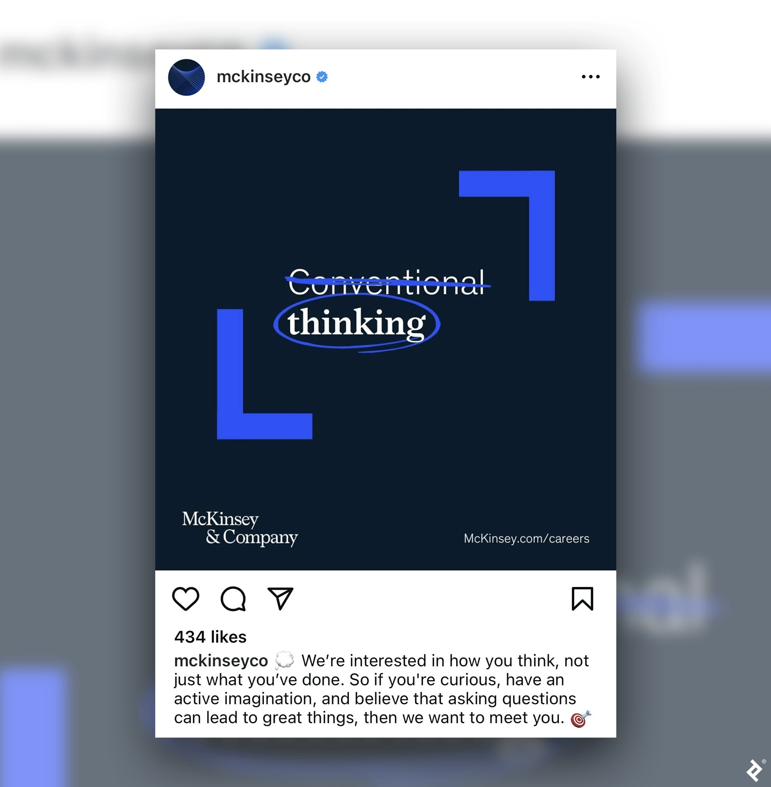
From an aesthetic standpoint, exploring typographic techniques such as text overlays, hand lettering, animated text, and unconventional typographic layouts can make your posts more captivating and prompt viewers to engage with your content. The key here is to stay true to your brand while occasionally finding opportunities to experiment with new typographic trends. For brands with a more conservative aesthetic, subtle experimentation, even something as simple as crossing out a word, can infuse content with energy without straying from the brand’s identity.
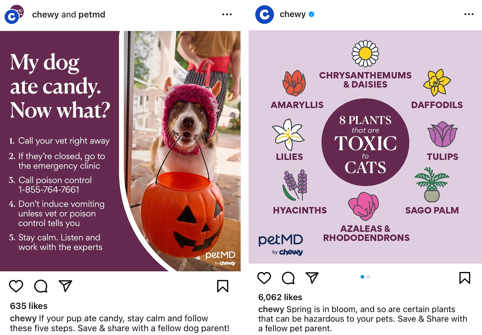
Another way to elevate your posts is to tailor typography to individual social platforms. For instance, posting an intriguing photo without any text on a visually focused site like Instagram might pique viewers’ curiosity and motivate them to read a detailed caption. On the other hand, LinkedIn users expect highly informational content and visuals and may appreciate concise text within a graphic.
Finding a balance between stylistic innovation and brand consistency is one of the most crucial strategic considerations of social media success, and typography is teeming with opportunities for creative experimentation.
Intriguing Visual Stories
A company’s social media posts should work together to tell its story instead of existing as a series of one-off visuals. Viewing posts as isolated attempts to attract attention overlooks a significant opportunity to build ongoing and engaging brand narratives.
That’s where visual storytelling comes in. To explore this concept, let’s compare social media posts to movies—which are basically sequential collections of curated images that tell an overarching story. Similarly, each post you make, while unique, should support your company’s broader brand narrative, creating a recognizable “world” that is appealing and instantly recognizable to your audience.
Fortunately, a strategic design approach can help you achieve this cohesion. One method is to use design templates for different types of social posts, such as company announcements, customer testimonials, and product updates. The goal of using templates isn’t to make every post within a category look identical but to create consistent formats that help your audience quickly identify the types of content that matter most to them.
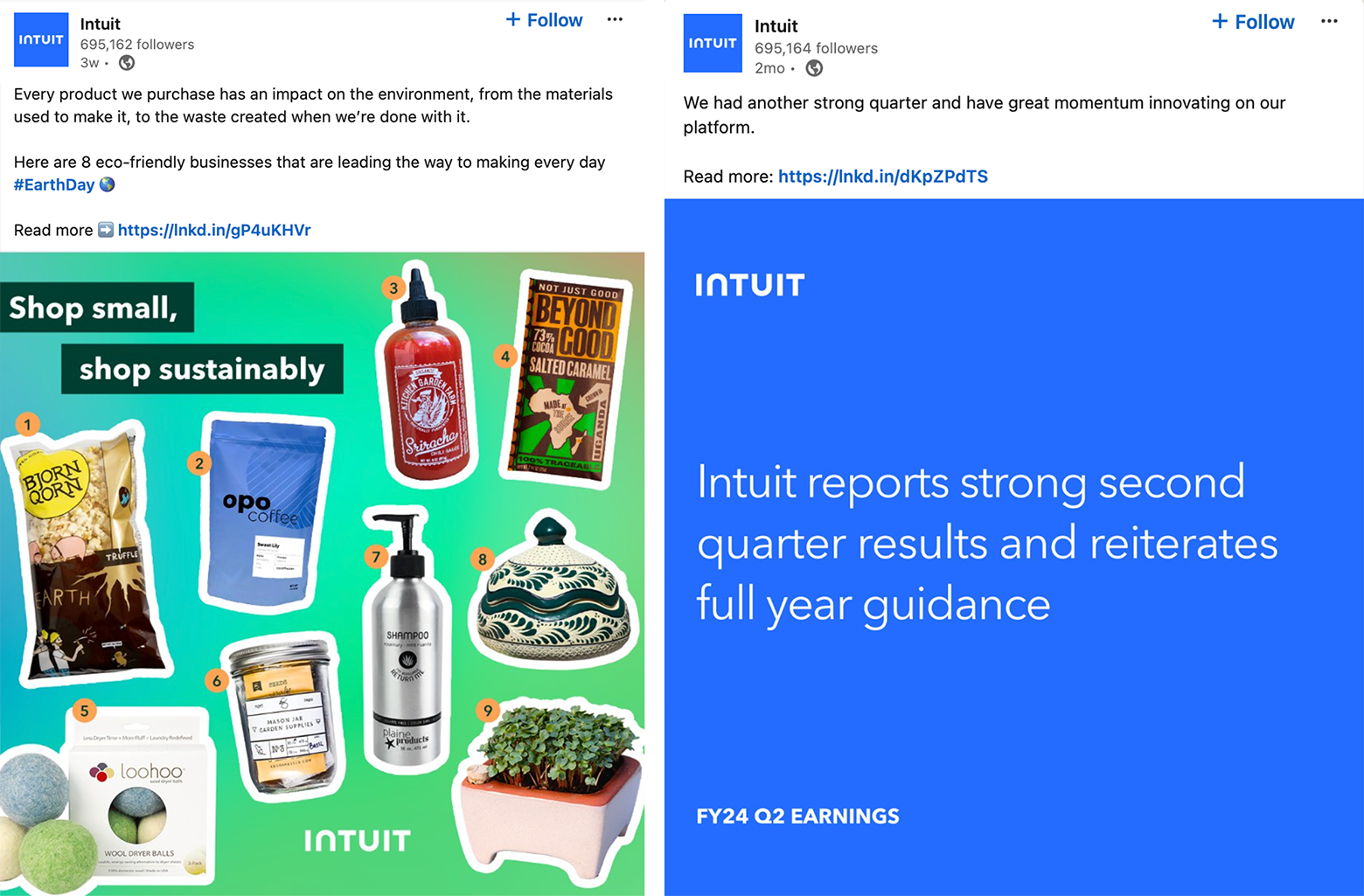
Another storytelling technique is the “show, don’t tell” rule, which emphasizes using high-quality images and illustrations to convey your company’s message instead of lengthy text descriptions. For instance, a company that champions sustainability might post photos highlighting the recycled materials used in its products or an infographic explaining how its green manufacturing processes reduce waste. The aim here is to demonstrate value through visuals, which can illuminate concepts and emotions not easily put into words.
I once worked with a global agriculture company to create social media post designs that showcased how soil analysis innovations made by its software development team led to more sustainable farming practices. Explaining those innovations was challenging, however, because it involved complex numerical data. To better connect with my client’s target audience in the agriculture and sustainability communities, I shifted the focus of the posts away from numbers and created a series of simple infographics that emphasized the positive impact the team’s work had on farmers, specifically farmers in developing areas whose livelihoods depended on this work.
Visuals like before-and-after comparisons, behind-the-scenes images, and customer photos and stories can significantly boost interest in your company’s social content. These methods resonate with people’s innate interest in transformational journeys and curiosity about how things work. (A word of caution: Authenticity is crucial for this type of content. Staged, doctored, or otherwise misleading images will undermine your audience’s trust and could damage your brand’s reputation.)
Whether you’re using before-and-after photos to demonstrate a product’s effectiveness or spotlighting how a service offering changed someone’s life, these strategies emphasize outcomes and improvement—which is really what your audience is after in the first place.

Laying the Groundwork for Social Media Graphic Design
When organizations engage a graphic designer to create social media images, it’s helpful to prepare a concrete creative vision for them to build on. This means having an idea of what the company’s content should look like and the message it needs to convey, which can help use design resources efficiently, saving time and money by eliminating excessive iterations.
Articulating the company’s creative vision can be as simple as writing a vision statement for the project, or creating a list of descriptive words that capture your content’s style and message tone. And while there are many vision formats and frameworks available, I recommend keeping things simple. Just make sure you:
- Outline the problems your project aims to solve.
- Identify sources of visual inspiration.
- Define your company’s style and message tone.
- State the project’s intended outcomes.
- Include a brief statement that unifies and motivates stakeholders.
In addition to solidifying your creative vision, your project or design brief should provide design specifications such as information about your company’s social media audience, key project stakeholders, and a clear budget and timeline. If you’re part of a marketing team, share how the social media posts fit into your marketing strategy. It’s also helpful to agree on revision expectations and what channels, such as Slack or email, you’ll use to communicate.
If your company has a style guide, it’s an asset, especially when laying the stylistic groundwork for a designer to collaborate with other team members. During the initial phases of art direction, explain which style guide elements are crucial for your company’s content, such as fonts, colors, and iconography, along with any stylistic directions the guide prohibits.
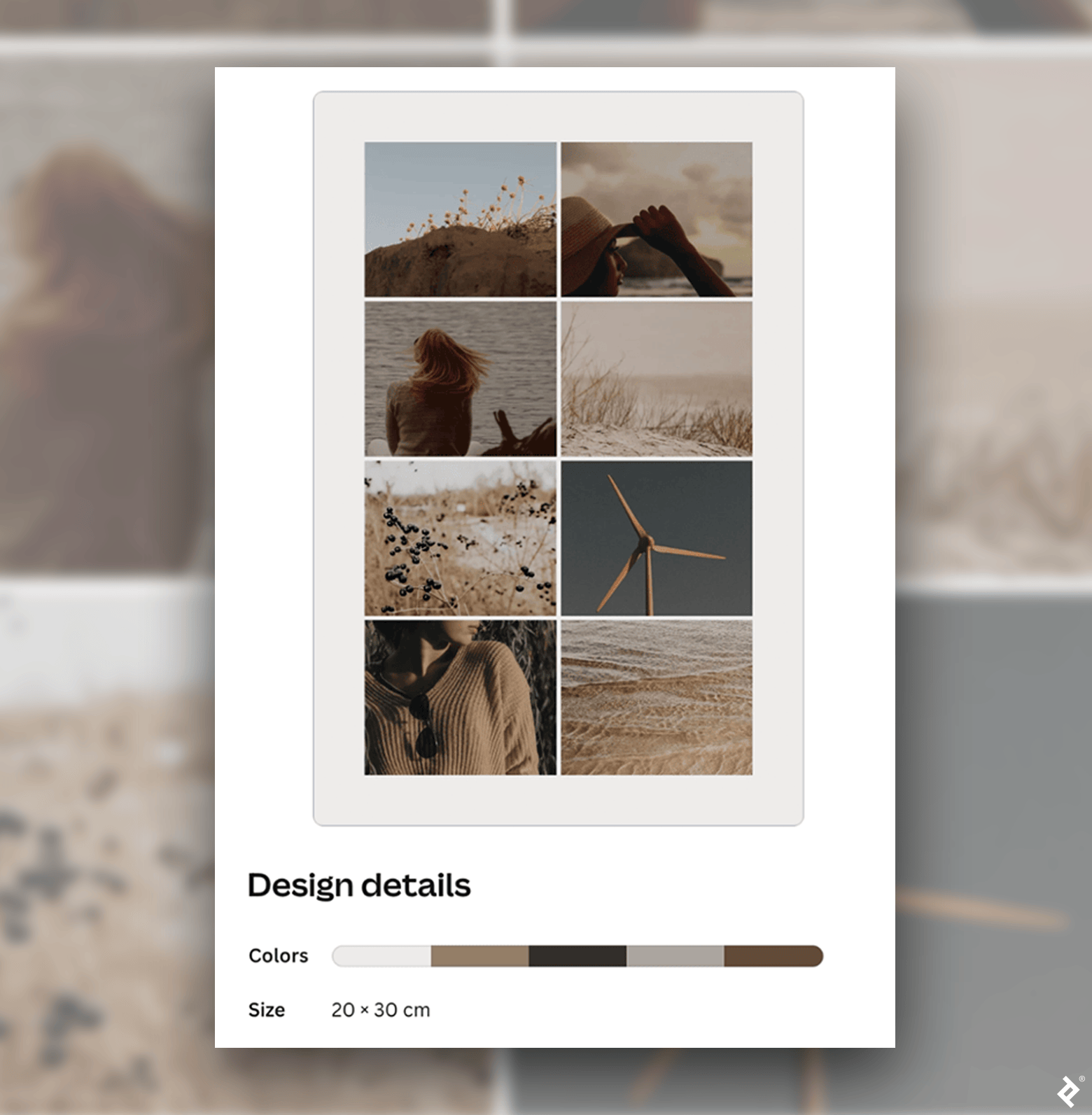
Mood boards, or collections of stylistically relevant images, are another effective art direction and design tool because they give designers artistic options that your audience connects with, and they help steer designers’ creative thinking in a specific direction. Platforms like Canva and Miro offer easy-to-use mood board creators, but even something as simple as a Google Slides deck or a document filled with inspirational images can significantly support a graphic designer’s creative process as they build your design assets.
Graphic Design Elevates Social Media Content
Social graphics are prime real estate for sharing your brand’s message and connecting with your audience. Your company’s content should be distinct, engaging, and consistent—and posts should work together to deliver an overarching narrative that clarifies what your company stands for and the value it provides.
The graphic design strategies, tips for successful art direction, and social media graphics examples we’ve explored can help boost engagement with your content and build brand recognition across social media channels. While many convenient design tools, such as Canva and Adobe Express, offer ready-made social media templates for posts, the value of a social media designer can’t be overstated. It takes a deep knowledge of design principles to create custom designs that clearly convey a message and stand out in a sea of content.
Further Reading on the Toptal Blog:
Understanding the basics
What is a social media graphic designer?
A social media graphic designer has a thorough knowledge of how to make social media graphics that grab attention, communicate a desired message, and enhance brand recognition. Designers collaborate with marketing teams and other stakeholders to understand a company’s audience, message tone, and goals to create effective, on-brand visuals for social media.
How do you use graphic design in social media?
Social media graphic design is not just the creation of polished images; it involves organizing information to emphasize the most important elements and prompt viewer interaction. Understanding color theory, typography, and visual storytelling is essential for creating appealing social media graphics.
How do you make graphics for Instagram?
When you’re exploring how to make graphics for Instagram, first consider what social media graphic design imagery resonates with your audience. Ensure the Instagram graphic is eye-catching while aligned with your brand’s identity. Instagram graphics should maintain a clean layout to make key information stand out.
How do you make graphics for Facebook?
As with Instagram graphics, prioritize simplicity and message clarity in your social media post design. You may benefit from balancing captivating imagery and informative content in your Facebook graphics, since Facebook users often expect more context and narrative within the posts they engage with.
Vancouver, WA, United States
Member since January 3, 2016
About the author
Micah is a digital designer who has worked with clients such as Google, Deloitte, and Autodesk. He is also the Managing Editor of Toptal’s Design and Technical Content. His design expertise has been featured in Fast Company, TNW, and other notable publications.
Previous Role
Digital DesignerPREVIOUSLY AT


